Duvall City Website Redesign Case Study
A website to invite visitors and speed up navigation

The Project
What is Duvall?
Duvall is a city in King County, Washington. Home to an
estimated 7,675 people located halfway between Monroe and Carnation, it is approximately 25 miles East of Seattle. The community is made up of tech workers that commute to nearby cities, farmers, and other local workers. The population prides themselves in their family oriented tight-knit lifestyle.
The Problem
The project tasked us with redesigning a city website to
enhance it’s tourism and overall
web presence. Primarily with a focus on promoting local events, activities, accomodations, etc. that attract visitors while touching on content flow, usability, and updated visual design. The current site is a chaotic mess of information, multiple navigation bars, and overwhelming dropdown menus that throw the user into a maze of web pages.
Solution
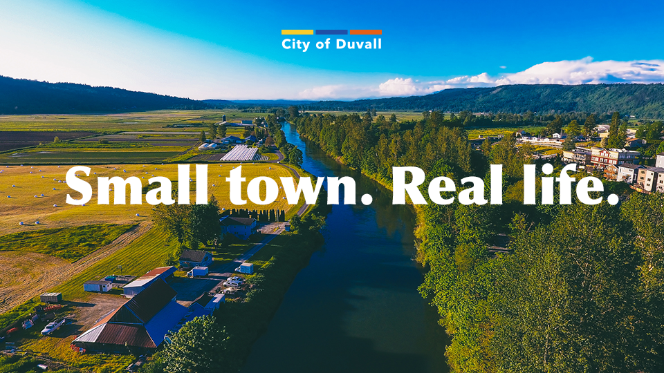
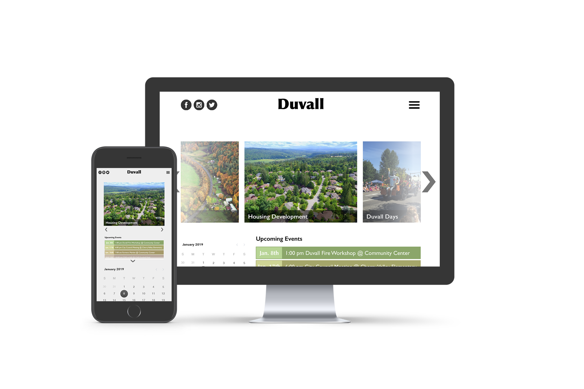
Duvall has been in the process of renovating it’s main street to make it more appealing to tourists. While it may look wonderful for locals, prospective visitors need to be able to see and hear about the city to want to visit it. So, the new website design puts Duvall on display. Large beautiful photography draws in visitors and gives locals something to be proud of. The cleaned up modern interface allows simple and quick navigation for the informative site.
Why Redesign?
A quick look at the mess being cleaned up

“Where do I look?”
The site may load quickly, but once it opens—your eyes jump all over the screen. Three different navigation bars, a large banner with a distracting logo, and a large photo pulling you to the center of the page. The page pulls you apart and gives you no room to squirm.
“So 2000 and late!”
The structure of the page is reminiscent of the simple 2000 HTML web design structure scene across many unupdated city websites. The site also uses many relics of web design past such as drop shadows, inner glows, and gradients.
“I can’t find...”
The hierarchy of the page is all over the place. Even when you think you are under the right drop down menu, it fills your screen with even more information to shift through.


Early Problems
One thing I struggled with almost immediately was how to design a beautiful city website that broke the monotonous structure and look of a stereotypical city website. I also had difficulty adjusting to sketch and everything I created was oversized. As you can see below, the website is cleaned up and structured. However, the visual language is boring, stale, and ugly. Basically everything I didn’t set out to do.


It got a little weird
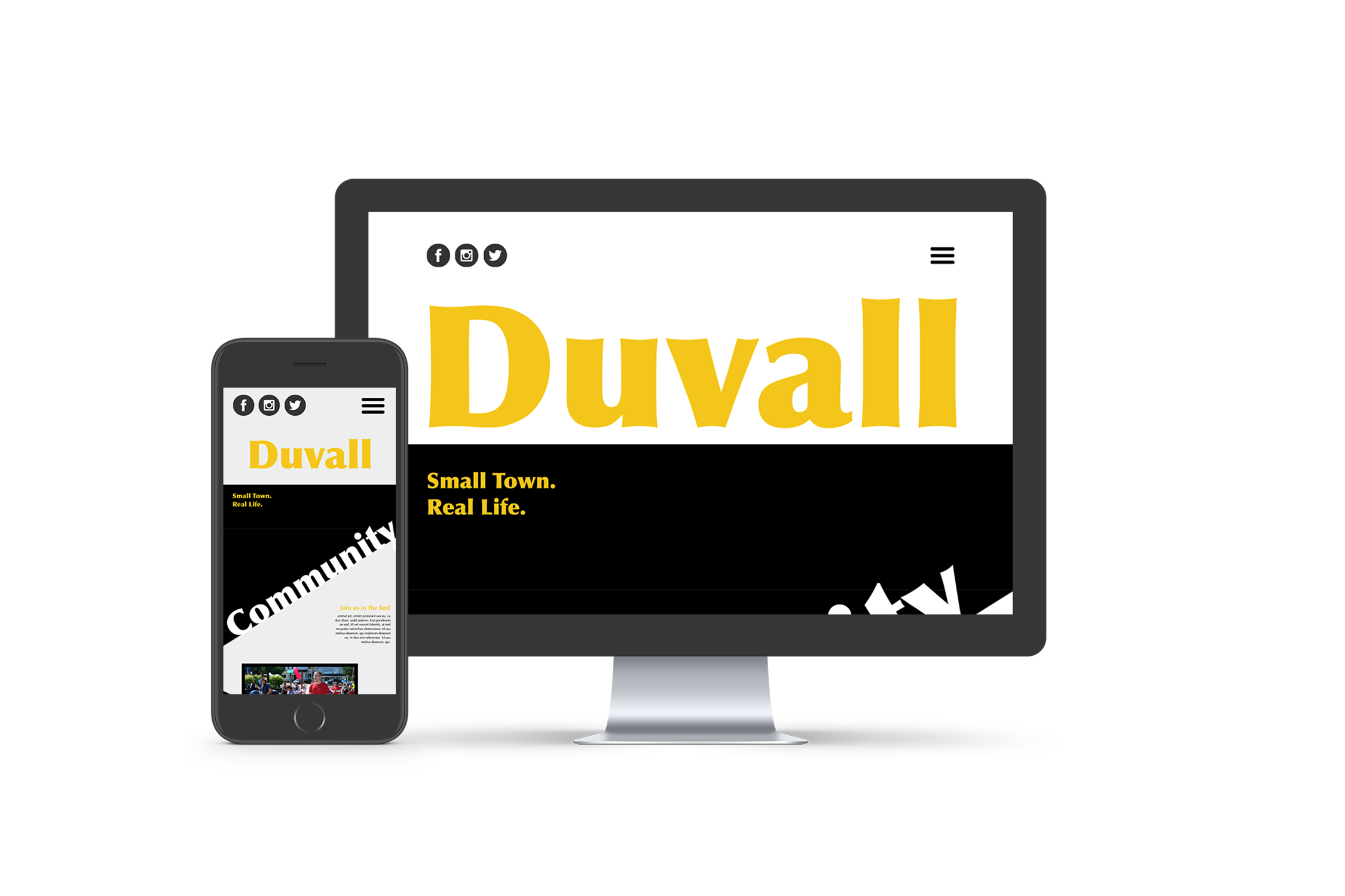
While trying to understand sketch better and break out of my creative rut, I created these next two website concepts. The left was as minimal as I could visually create a site. This allowed me to hone in focus on the organization of the page without worrying about the visuals too much. This site came as good practice for the work ahead. The site on the right is fun, loud, and way too bold for a city site. It was a good opportunity to see how far I could push a city site, but in the end I still had not found a direction.


Last Ditch Effort
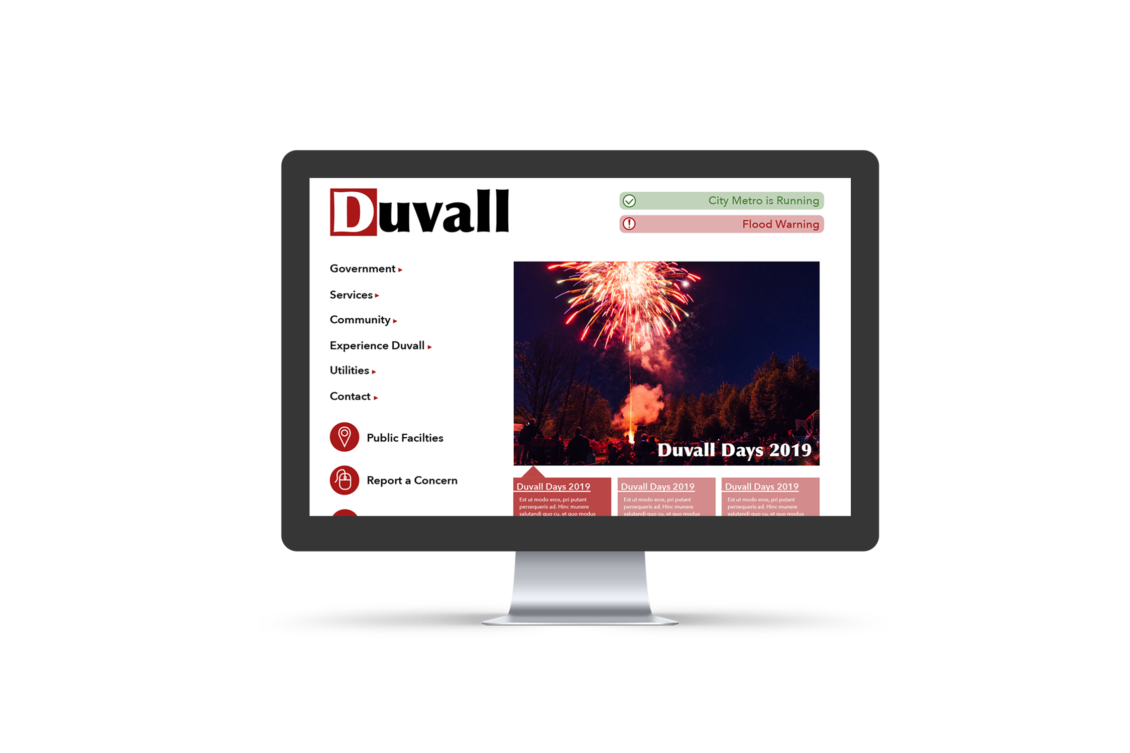
Before discovering my finale direction. I took all the elements I liked from the last four designs and combined into one page. Yet, laid out together it still felt outdated. Who would have thought combining outdated looking websites would create one just as outdated (hint: I didn’t). Yet, you will see that I took many of these elements and did apply them to the final site. This last ditch effort to stay connected to the original Duvall brand brought me the arrow motif, icons, and Optima typeface that I carried over to the city redesign.

Final Direction
The Actual Rebrand
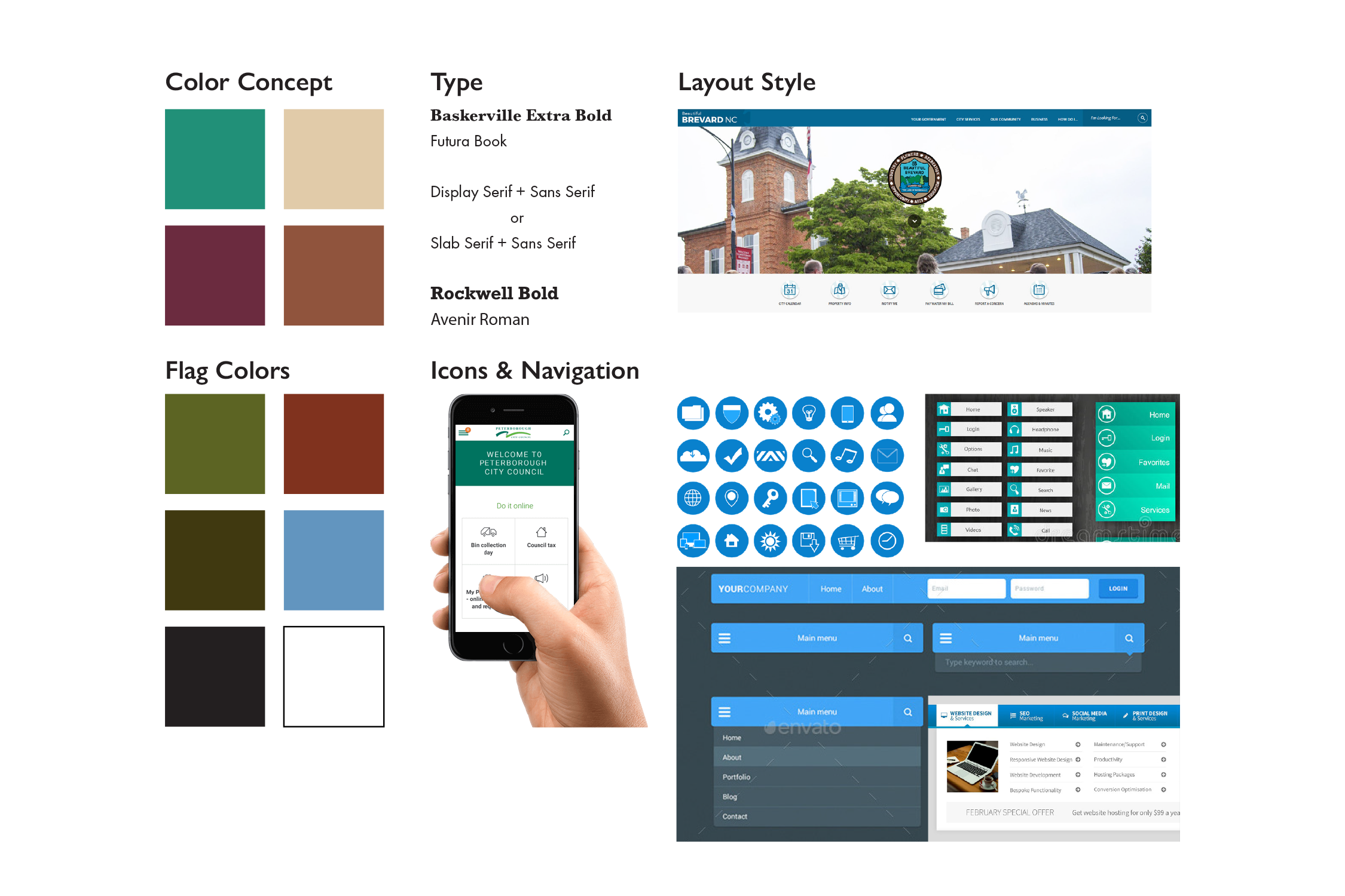
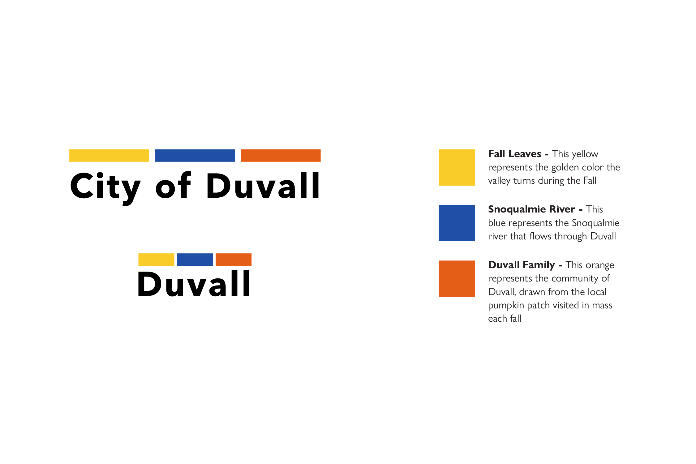
I realized I needed a structure. I had to sever the connection between the old Duvall brand and the one I was creating. While I did keep the three boxes of color, I shrunk them down to create a better mark shape seeing how the squares weren’t actually relevant to the old brand. I also changed the colors to provide a stronger color scheme for the city, while also keeping it in line with the community values and the land.

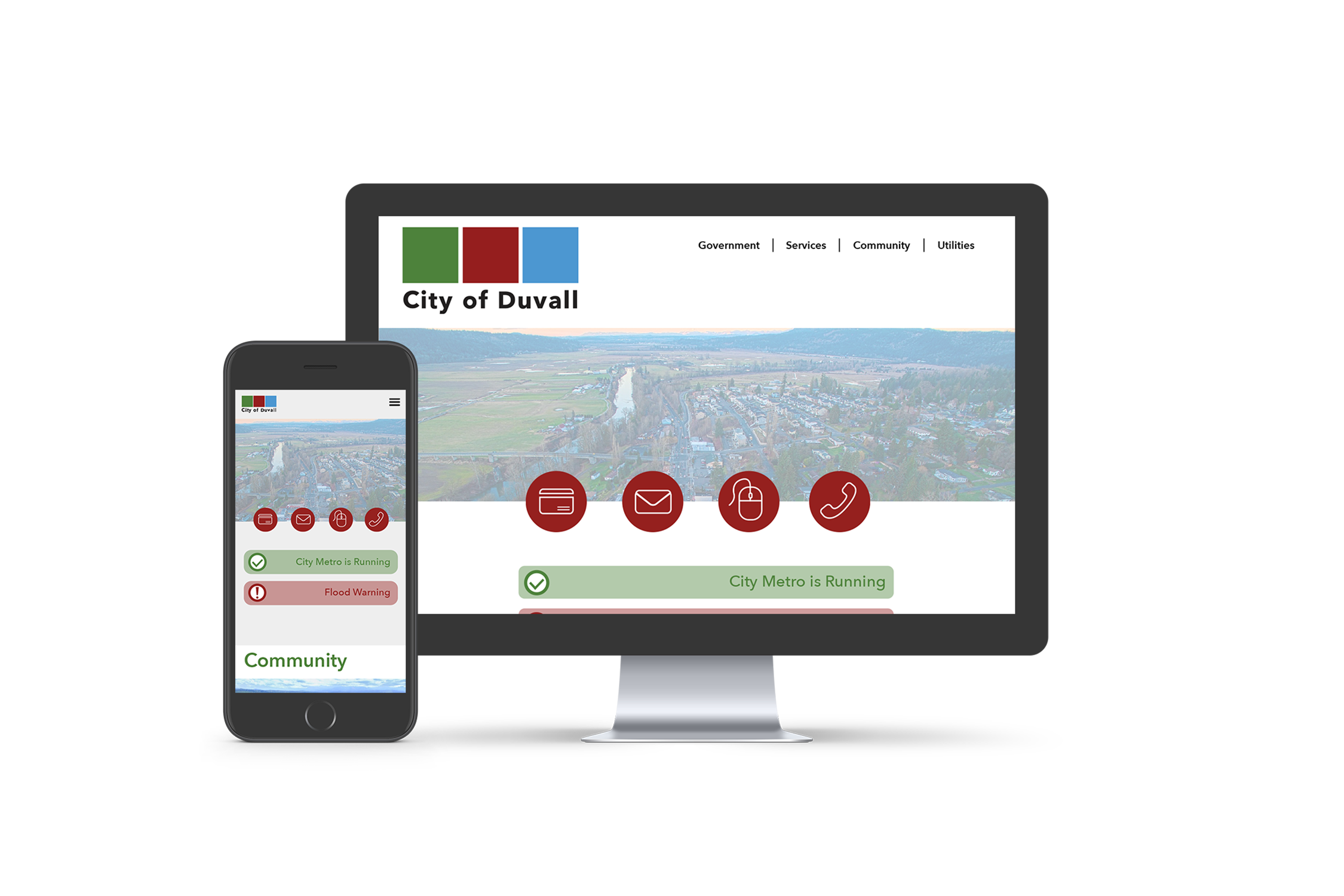
Home Page
I realized I needed a structure. I had to sever the connection between the old Duvall brand and the one I was creating. While I did keep the three boxes of color, I shrunk them down to create a better mark shape seeing how the squares weren’t actually relevant to the old brand. I also changed the colors to provide a stronger color scheme for the city, while also keeping it in line with the community values and the land.

A Good First Impression
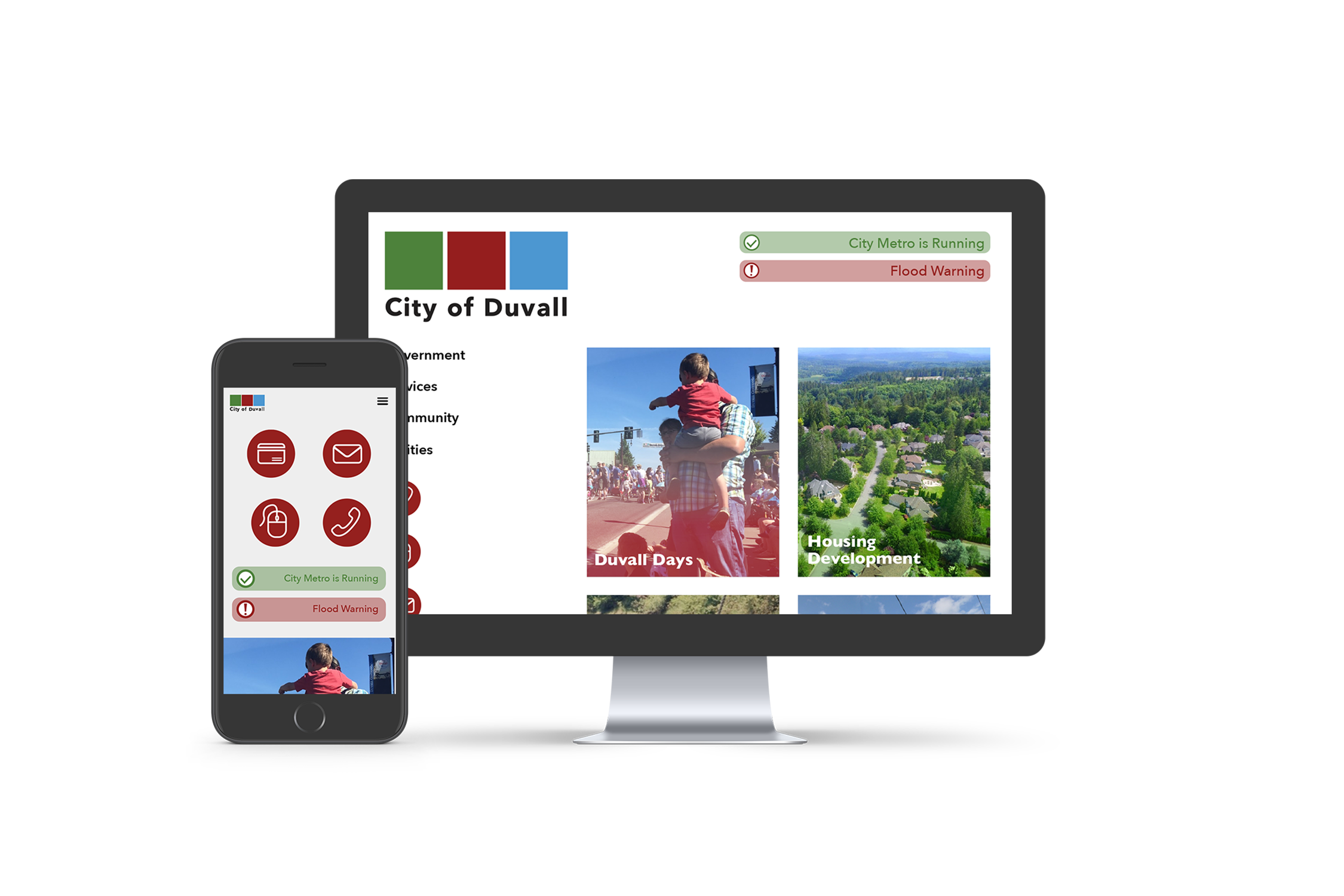
Anyone new to Duvall will be blown away by the immediate content and visuals drawing them towards the city. Duvall is not an incredibly well known town, so a first impression is incredibly important. This new website does just that, greets you at the door and welcomes you on a great adventure.


The Duvall resident is not forgotten at all with this site. The local news is put on the home page to allow easy access for residents looking for a quick brief on things going on in their city.
Tourism Page
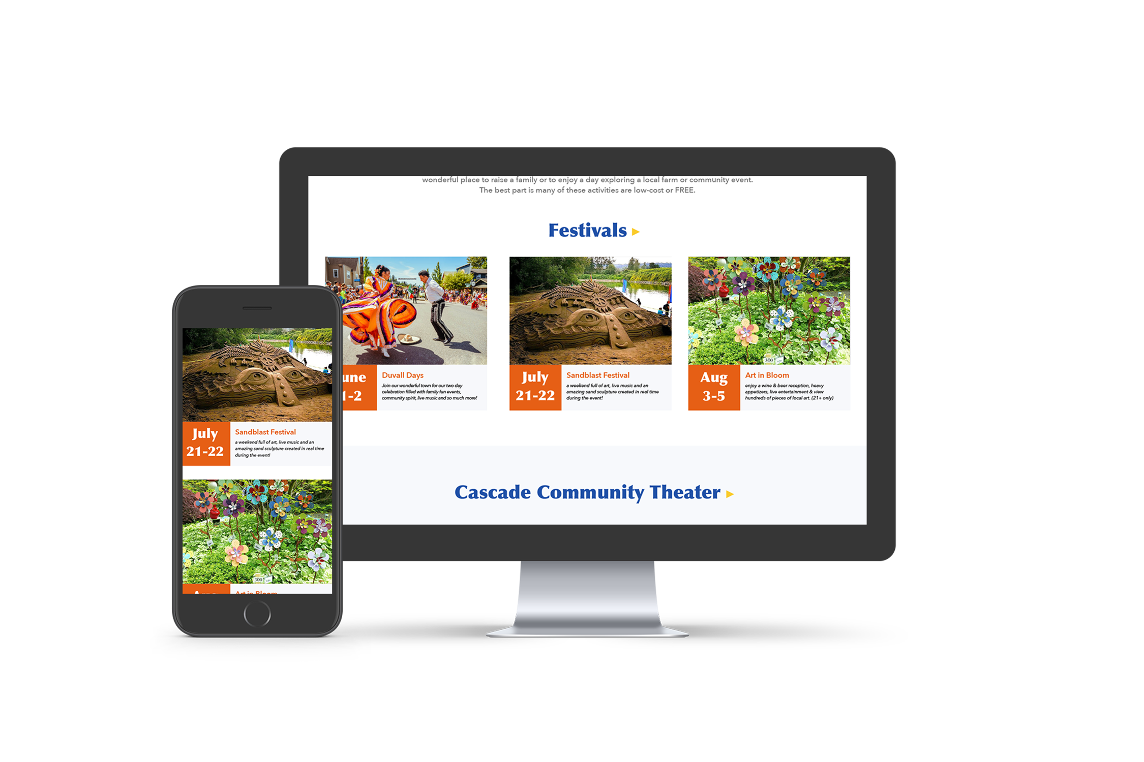
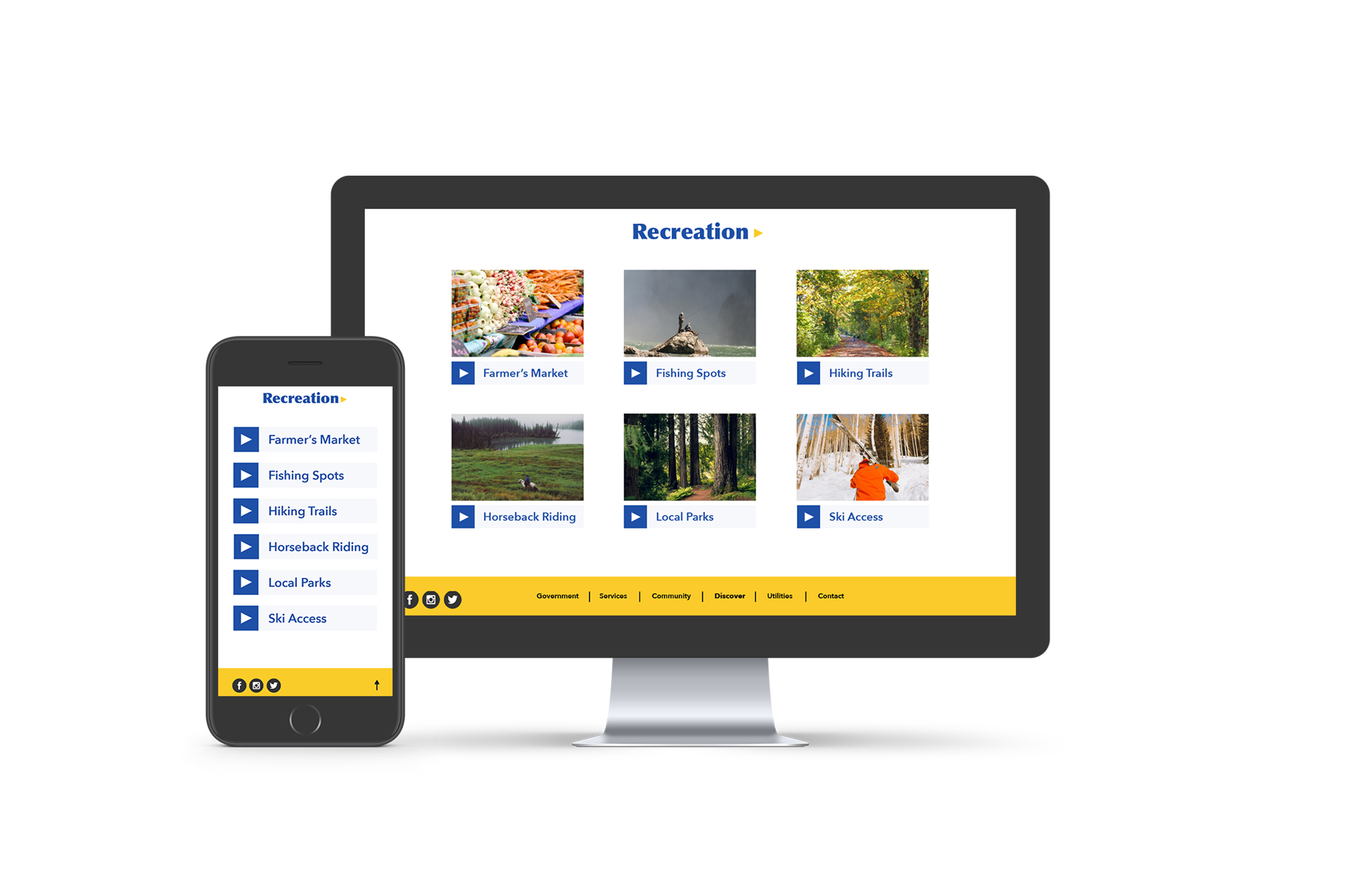
Whether you are a prospective visitor, a current visitor, or even a bored resident Duvall has something for you! Exploring what to do in Duvall has been made an adventure in itself with beautiful intriguing photos.


Duvall Days Event Page
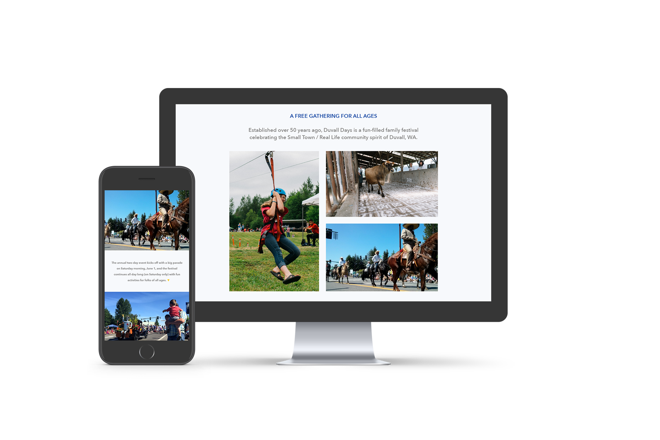
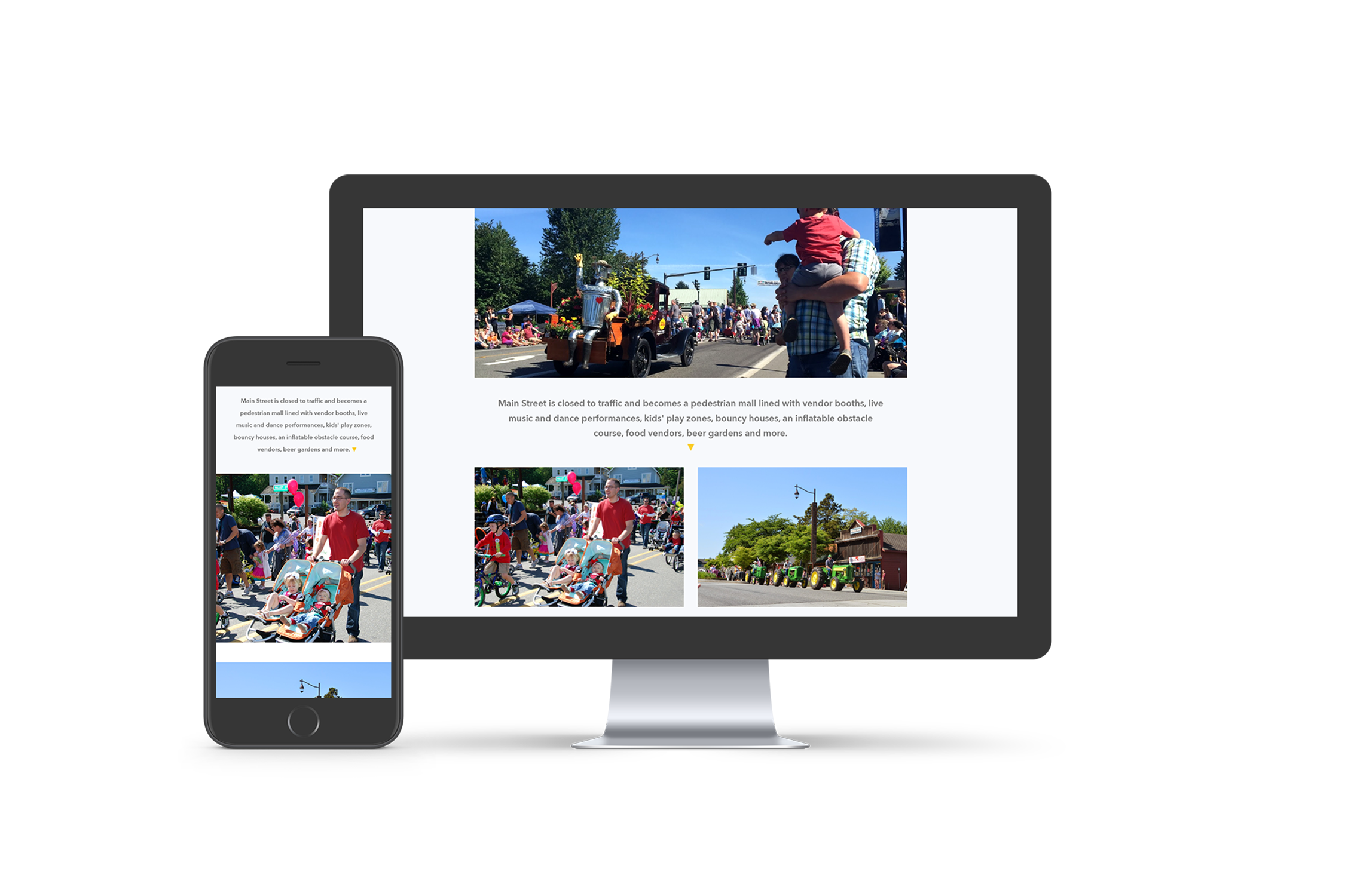
The final page is the final hook to secure any visitors interested in Duvall. The full screen photo and countdown give you plenty to get excited for.


User Testing
User testing on the original site proved cofusing for users, who often found someselves lost in a sea of links, webpages, and content.
With the new site design
Almost immediately, progress was seen in the user testing of the updated site. A returning tester who struggled with the initial site completed their tasks at a record speed. There were a few hiccups from miscommunicating icons to a few uneventful layout designs, but navigation proved to be a success.

FIN

