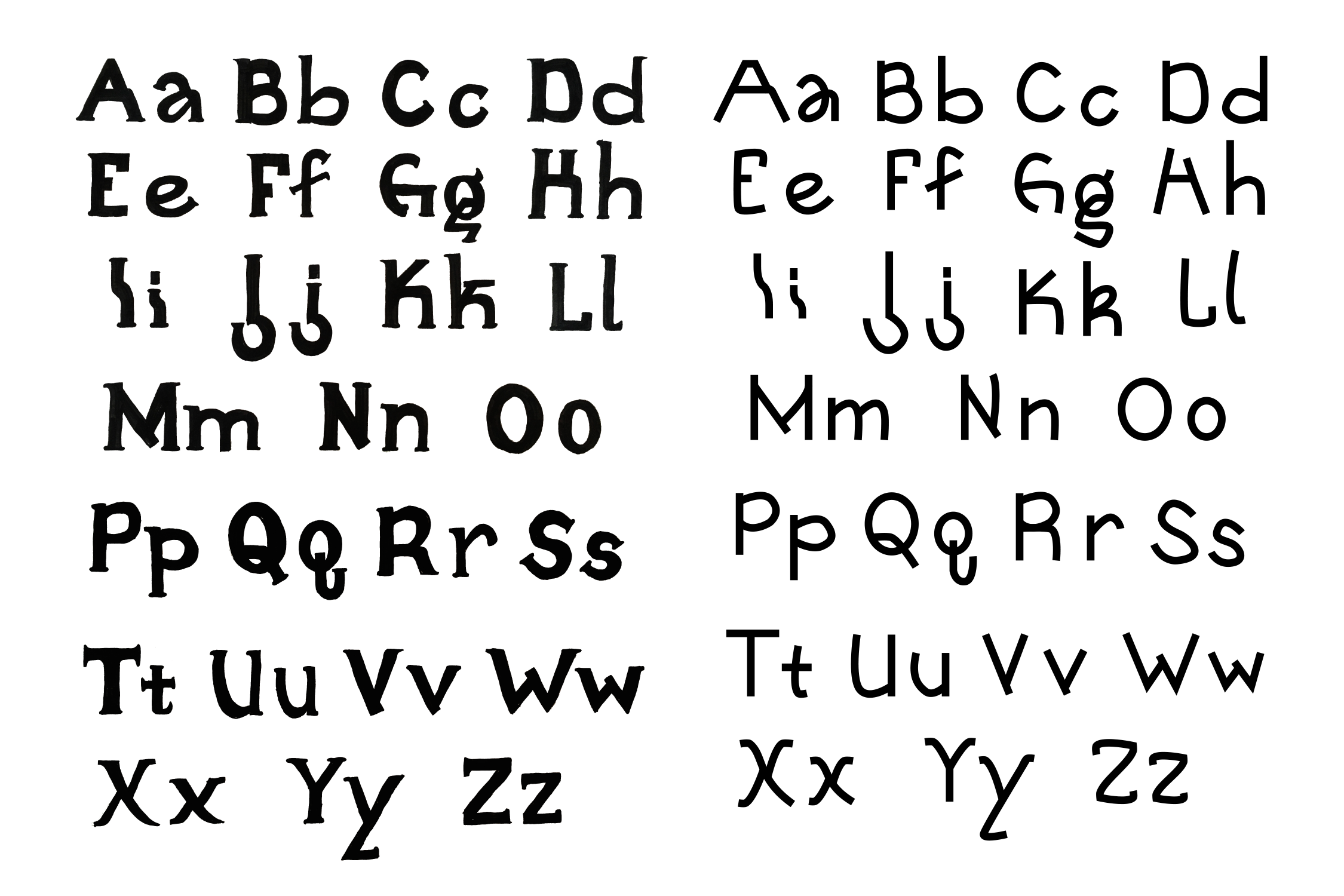
Lusi Sans Typeface
An Exploration of Letter Forms and Legibility

Typeface
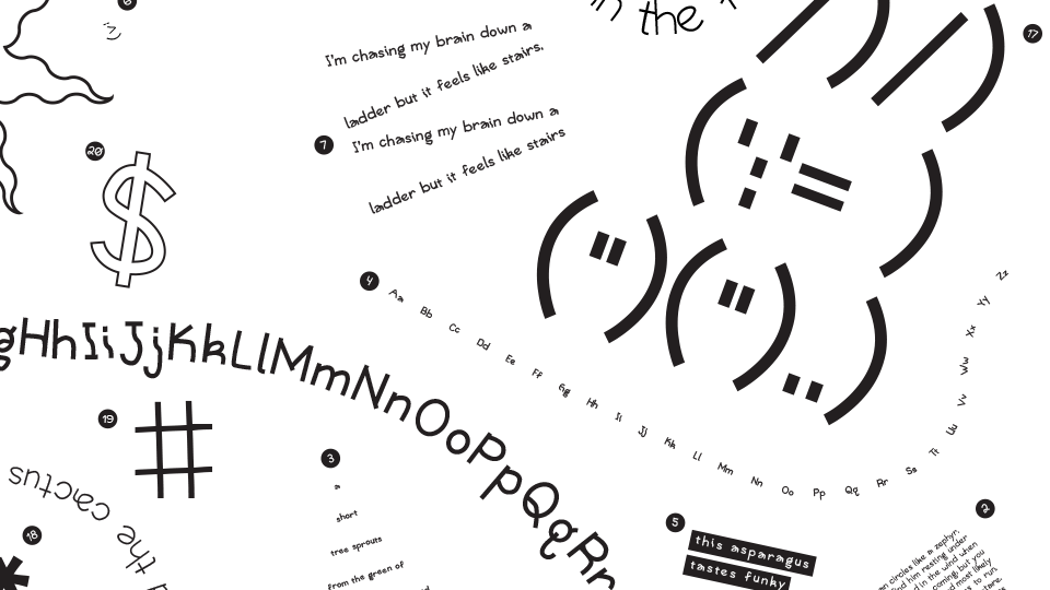
The shape of a letter is all that matters
Lusi Sans is the first typeface in a series of typefaces that questions how we read letter forms. It is inspired by post-typewriter handwriting, where handwriting is no longer about neat communication—but quick marks for personal use.


Inspired by the digital era where handwriting is no longer about communication
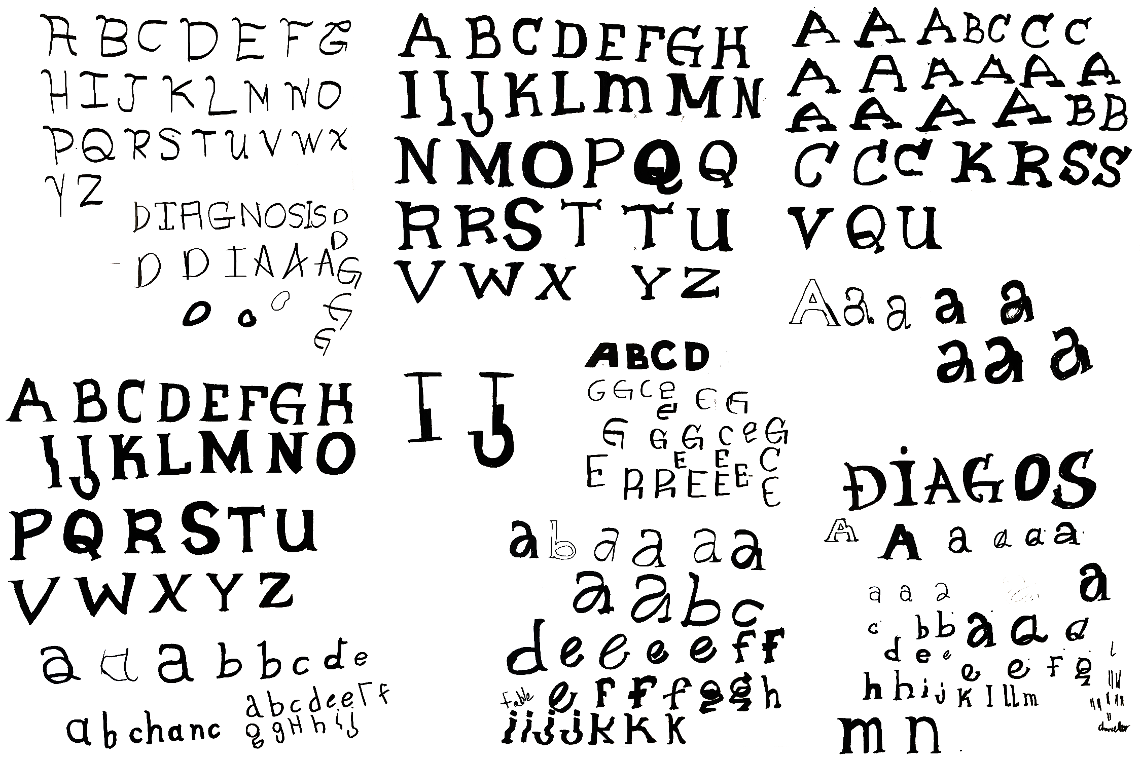
Process
Endless Possibilities
Lusi Sans started as a old style bookface inspired by contemporary handwriting. It evolved into a san serif to explore the letterforms as well as give myself time to become comfortable with type design programs. Below is sketching from the process that built this typeface.

You can never have too many letters

Reflection
A steam engine needs steam to run
Looking back, I had a lot of strong process and good ideas for the typeface. I relied too much on my abilities to digitize the typeface and didn't complete a hand drawing of the type that I was content with. This project was also done during an online course during the COVID-19 pandemic. I think if I had been in a classroom like I had during my letter sketches, I would have found more success in this typeface. However, I am still happy I was able to completely design a typeface from start to finish.