Universe Type Specimen Booklet
A retro look at a retro font
The Project
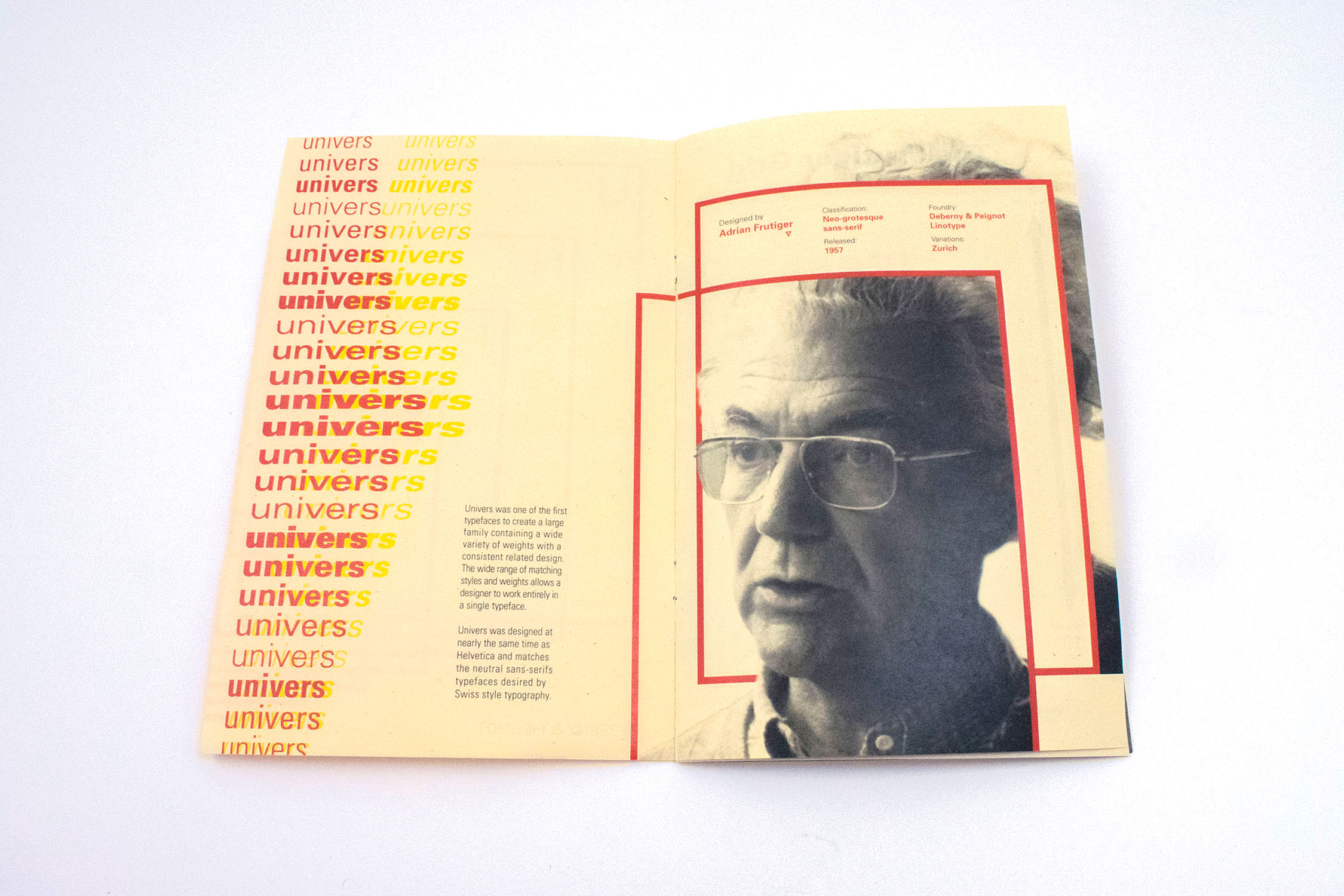
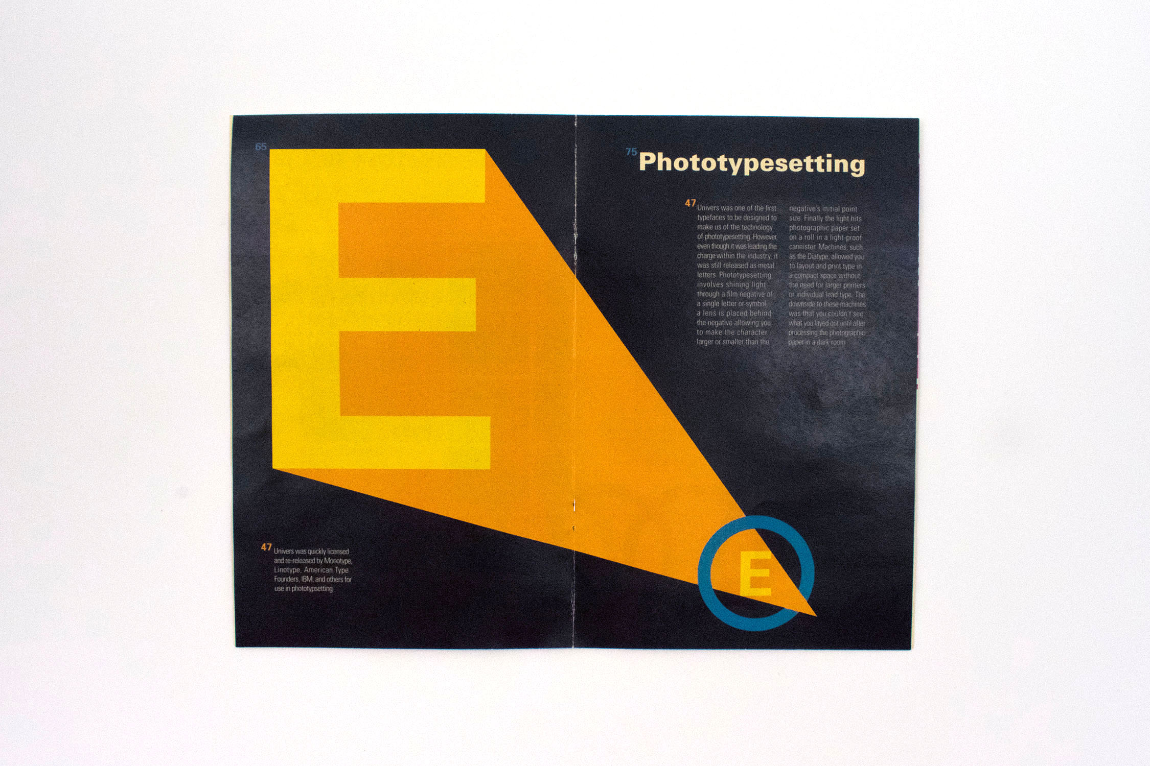
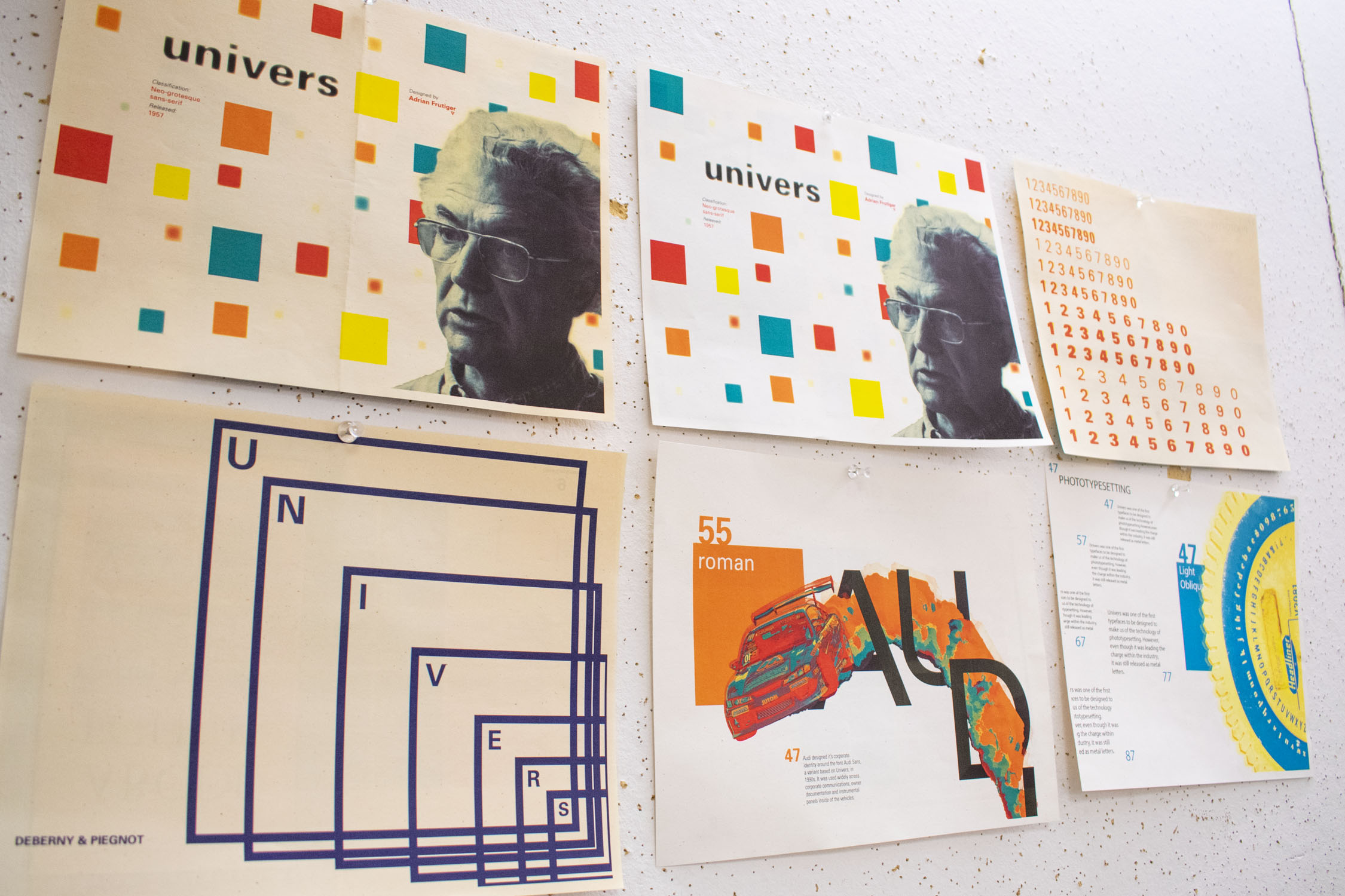
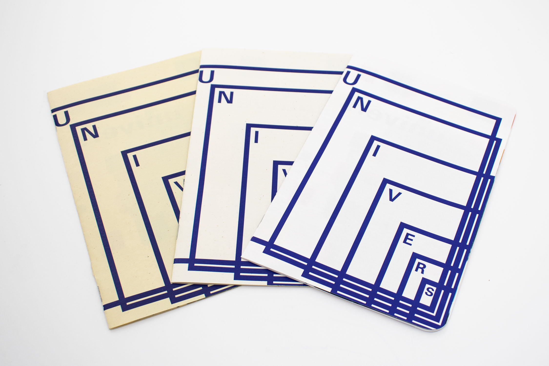
Univers is a typeface designed by Adrian Frutiger released in 1957. The type specimen booklet is inspired by retro visual design from the time the typeface was designed and famously used.

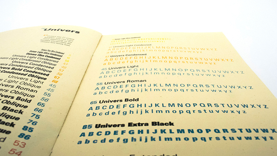
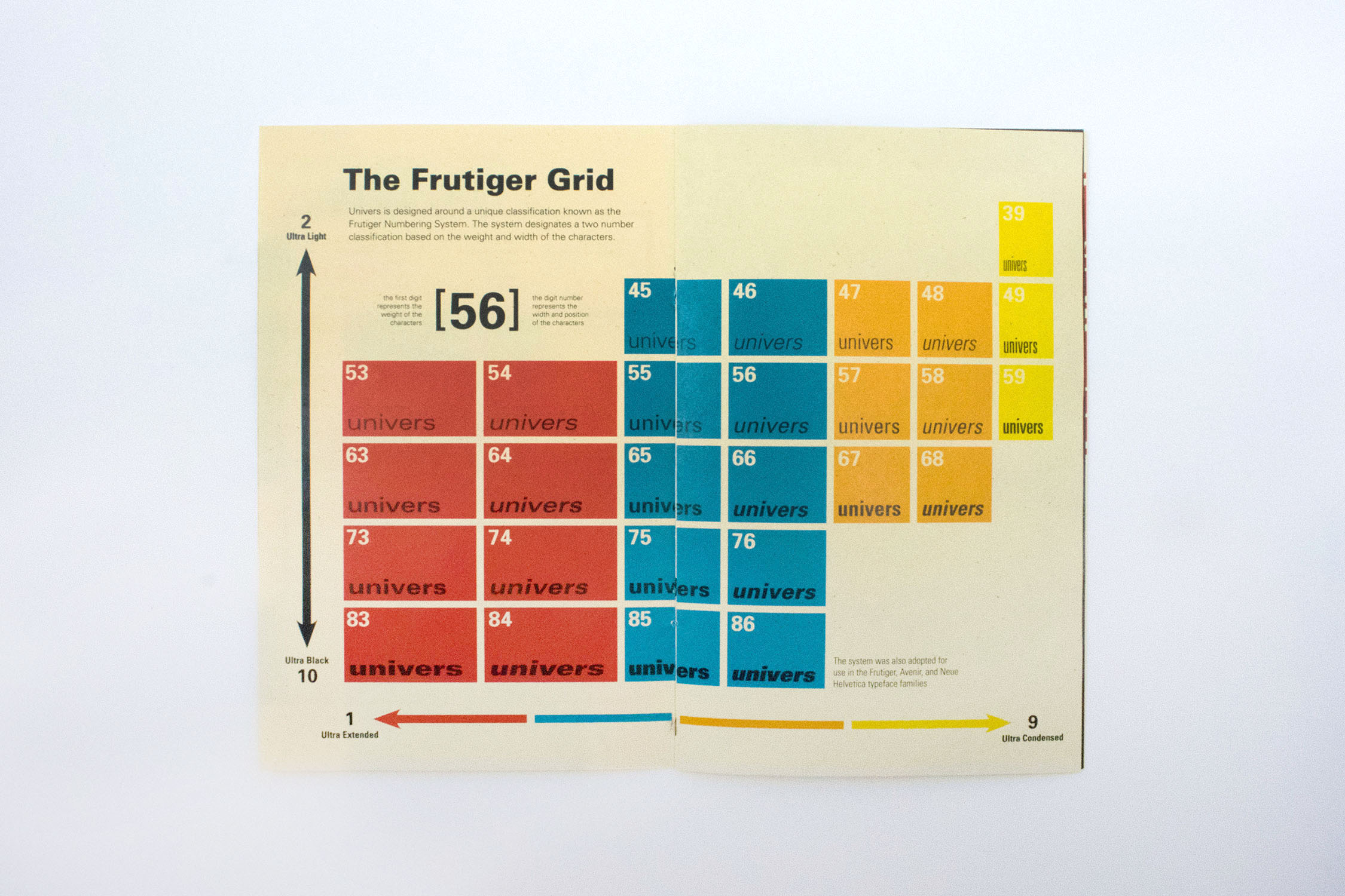
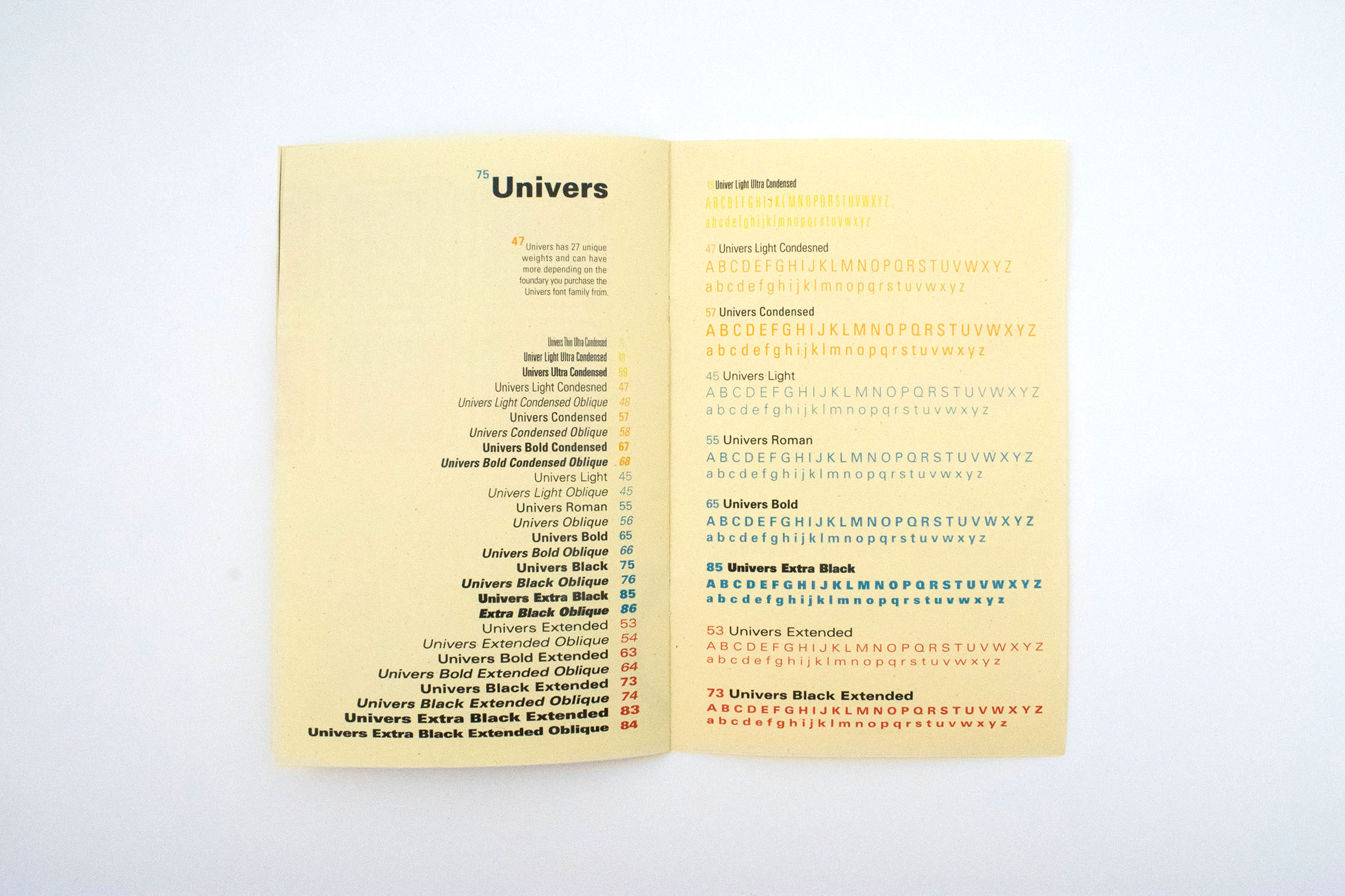
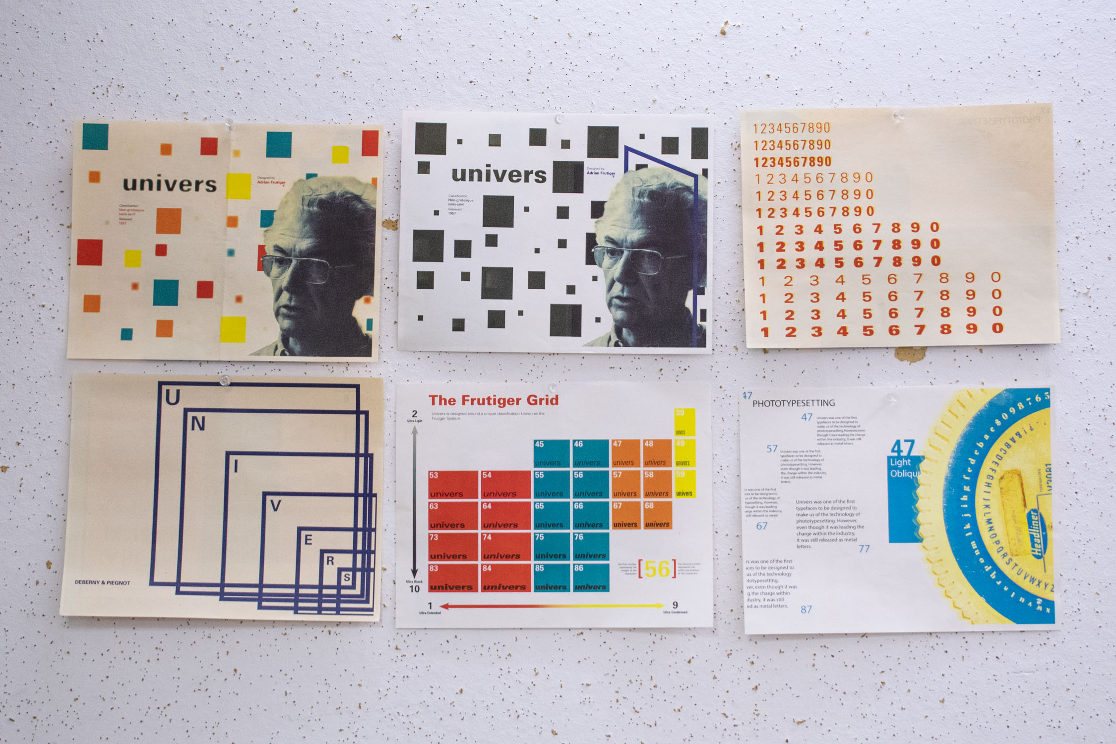
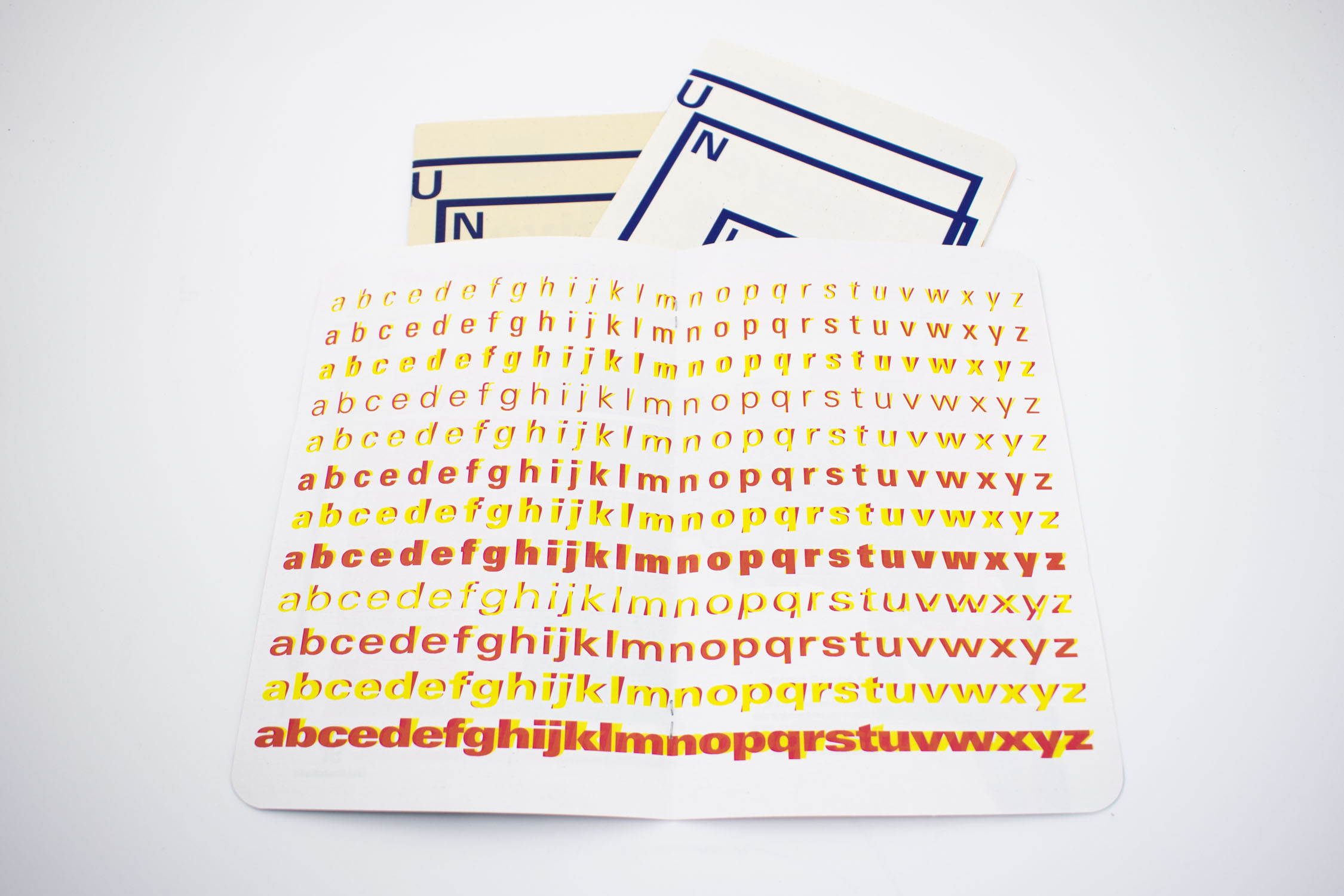
The Typeface is known for being designed around the Frutiger numbering system. The system designated each weight a 2 digit number based on the weight and width of the type. I wanted to focus on this grid, even recreating the iconic periodic table style diagram showing all the family’s weights. Each piece of type in the booklet is noted with its corresponding number.


The color scheme is designed around the diagram for Frutiger's Grid, the science textbook style is built around it, and the numbering system is used alongside each body of type so the consumer can learn the system and find which weights they would like to purchase

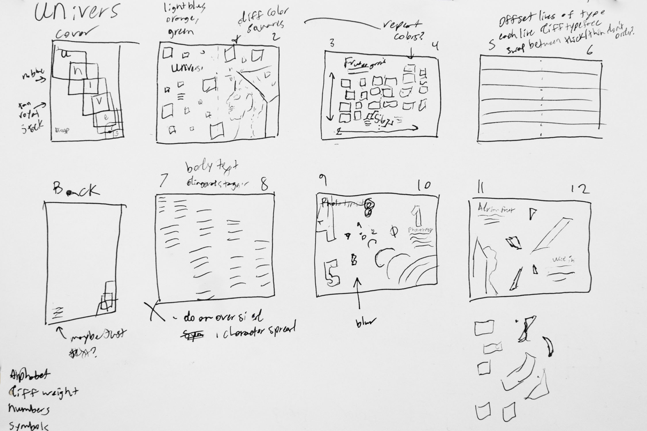
Immediately after choosing Univers as my typeface, I knew that I wanted to play with the retro graphical style seen in Frutiger's Grid the typeface is designed around. I planned to combine that style with photography, but that changed through more iterations.


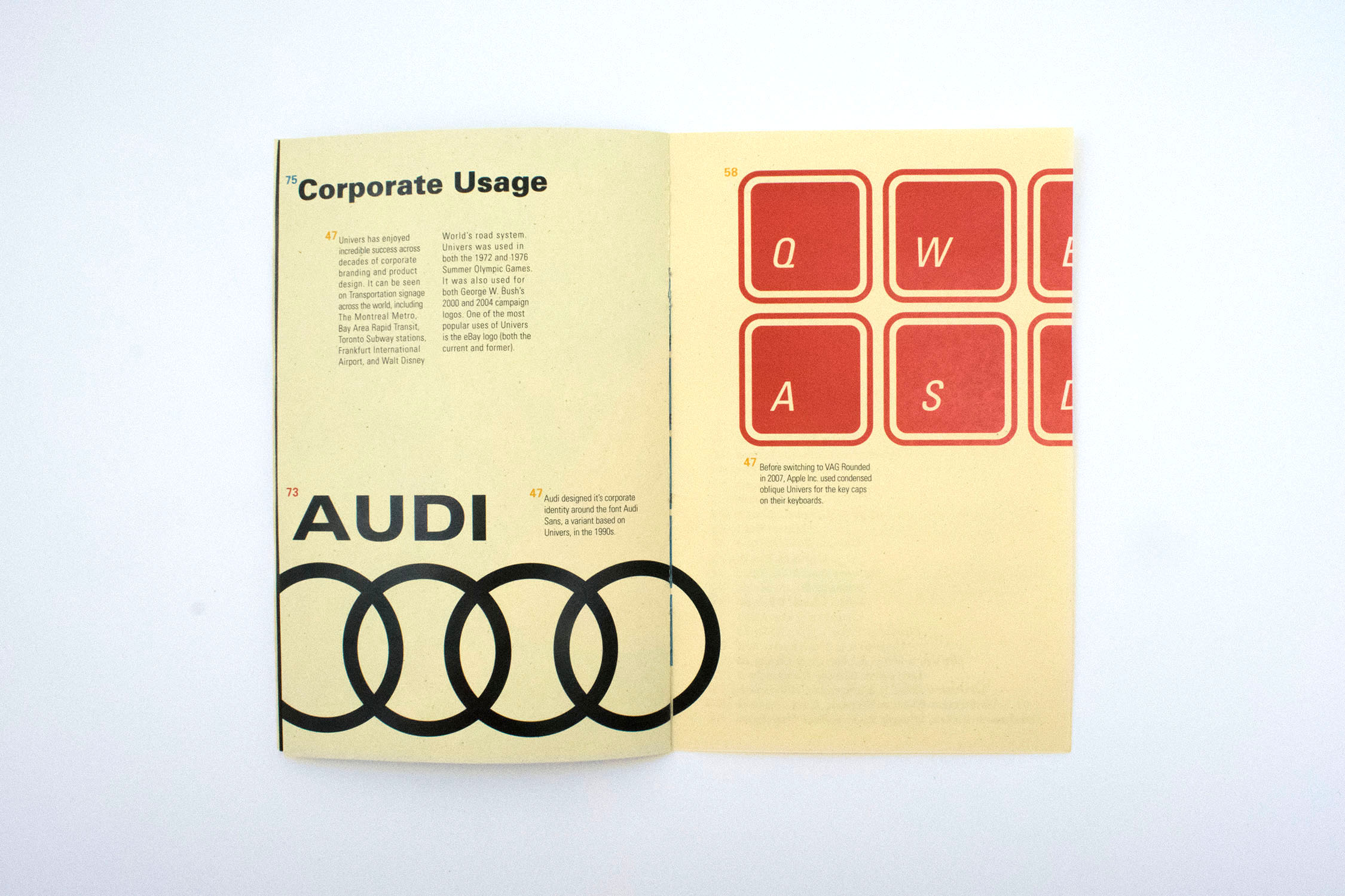
The initial booklet had a clash of three different styles. Retro 60's aesthetics clashed with the 90's patterning I had and neither worked with the modern digital photo editing used towards the end of the booklet. Finally, the booklet was honed into the fully embrace the 60's aesthetic I started with to create a fully cohesive booklet.
FIN

